The Panasonic PT-AT6000E, also known in North America as the PT-AE8000U, is the Japanese brand’s second 3D home cinema projector, and, as it happens, the first projector to go through our rigorous tests.
This is Panasonic’s only current projector designed for high-end home theatre use. Rather than producing a top-end model and removing features to create products to hit a wider variety of price points, the company is concentrating solely on one £3000 unit. It’s LCD-based and includes three Full HD 1920×1080 liquid crystal microdisplay panels, lit by a “Red-Rich Lamp”, which has been specifically designed to combat a lack of power in the red spectrum (a common issue in projector design). There are numerous other techniques used in the optical path to preserve colour purity – in fact, Panasonic claim that the PT-AT6000 can even reproduce the DCI-P3 colour gamut used in commercial digital cinema projection, which is quite an achievement for a consumer projector. Although we have no DCI content for home usage, we should have little to worry about when it comes to reproducing the HDTV Rec.709 gamut, knowing that the AT6000E can manage something wider. Indeed, there’s a dedicated “Rec709” mode which should get users well on the way to accurate, cinematic images with home sources, such as Blu-ray players and HDTV set-top boxes.
Panasonic also isn’t shy about mentioning the fact that it’s consulted with Hollywood colourists and others close to the filmmaking industry in adjusting the PT-AT6000’s performance, reminding buyers that the unit is “Hollywood tuned”. There’s also a Lens Memory function too, which allows different combinations of zoom and focus settings to be saved and recalled (which, in some setups, can act as a convenient way to handle multiple aspect ratios without manually adjusting the projector settings).
We’ve become known for comprehensive reviews of flat-screen TVs, and the Panasonic PT-AT6000 is the first projector to go through this process. Wish it luck!
| Display Technology | 3LCD |
| Approx. Lamp Life | 4000 hours (5000 in eco mode) |
| Lamp Product Code and Approx. Price | ET-LAA410 / £300 |
| Lens Shift | Yes, H+V |
Note: the US/Canadian model is known as the PT-AE8000U. Although we tested the European model supplied by Panasonic UK, we feel that it’s safe to assume similar performance, given that Panasonic’s global web site refers to both model numbers simultaneously.
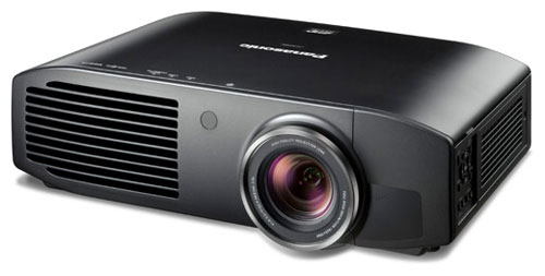
We’ve seen complaints before about Panasonic’s past projectors, which were plain and rectangular (honestly, we liked the designs). Like its predecessor, the PT-AT6000E shakes things up a little with curved edges, but that’s really it. The lens is situated off-centre, to the right of the unit. A hidden compartment can be removed to reveal the lens shift “joystick” – Panasonic are using a manual lens shift control rather than a motorised adjustment, and although it’s not as convenient to use, setup is only done once.
Moving on from aesthetics (it’s not a TV so you don’t even have to look at it!), the PT-AT6000’s power and video inputs are located on the back panel. A lens cap comes attached to the projector, which is functional, if not as convenient as an electronic sliding cover. The top panel (or bottom panel, if you have it ceiling mounted) flips open to reveal the lamp housing.
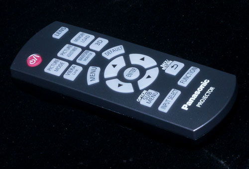
The remote control is a chunky little unit that fits in the hand easily. Given that in a projection environment, interaction with the device after calibration and setup (beyond turning it on and off) is limited anyway, it is more than adequate – especially seeing as it’s backlit.
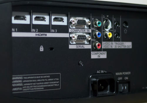 |
| Rear connections on Panasonic PT-AT6000 |
The PT-AT6000E’s menus are reminiscent of the ones found on Panasonic’s commercial plasma monitors, some of which have also made their way into high-end home cinema setups.
The top-level control is [Picture Mode], which contains some wide colour gamut presets, a GAME mode, some super-bright modes which push out light at the expense of overall quality, and best of all, the REC709 mode, which is the closest preset mode to the ITU HDTV specifications. This is the best quality mode for home use, because out of all the preset modes on the PT-AT6000, it will reproduce images as close as possible to those seen and signed-off on by the filmmakers.
Control over basic functions, and the [Dynamic Iris] is given. Drilling down into [Advanced Menu], there’s a gamma curve editor, and because this allows the Luminance as well as the R, G and B curves to be edited individually, it can be used as a 15-point Greyscale control. There’s also 2-point control given in the Advanced Menu, as well as control over [NR] and [MPEG NR] features (leave both off for high quality material on Blu-ray!). There’s also some motion interpolation and edge enhancement modes which we’ll discuss later.
Before any calibration took place, we had a look at some basic test patterns, and found that our PTAT6000E’s default [Brightness] setting was discarding shadow details, reproducing only levels 22 and above (video black is at code 16, so 17 above should be visible). We also reduced [Contrast] very slightly to avoid tinges of blue appearing in highlights.
Interestingly, the projector features some built-in waveform monitors, which we assume is a touch designed to give it a more professional feel.
![[Picture] menu](https://www.hdtvtest.co.uk/news/wp-content/uploads/2018/04/hardware_Panasonic-PT-AT6000_picture1.png) |
![[Picture] menu](https://www.hdtvtest.co.uk/news/wp-content/uploads/2018/04/hardware_Panasonic-PT-AT6000_picture2.png) |
| [Picture] menus |
Panasonic has strongly promoted the fact that the PT-AT6000E has been “Hollywood tuned”, with the company communicating that reproducing the directors’ intent is a priority. In fact, the company’s promotional site mentions that the Cinema 1 mode has been “tuned by top Hollywood colorists for watching a movie with smooth image quality”. As it happens, the Cinema 1 mode has a very wide colour gamut, which only causes standard HDTV/Rec709 content to look overly garish. It’s not completely unheard of for some of the better consumer projectors to make their way into grading suites, but as we alluded to above, the only content we have access to in the home is mastered on monitors conforming to Rec.709 (or sometimes, but increasingly less so, SMPTE-C). So, the Rec.709 mode is definitely the one to use if accuracy of Blu-ray, DVD, and HDTV content is your concern. Much like Sharp’s Quattron LCD TVs, with their rich, saturated yellow, the engineering achievement is impressive, although at present, it doesn’t really have a direct practical application for consumer use.
| Jump To: 1. DesignNext: Calibration3. Picture Quality |
jQuery(document).ready(function($) { var toc = $("#tableofcontents").html(); $("#tablecontents").html(toc); });